5 Interior Design Mistakes You’re Probably Making (and How to Fix Them!)
Your home should be a reflection of your unique style and personality, but all too often, common interior design mistakes can lead to spaces that feel disjointed, uncomfortable, or simply fall flat. Let’s explore five prevalent pitfalls that many homeowners encounter when designing their spaces. We’re providing expert tips and resources to help you navigate past these faux pas with style and confidence.
Mistake #1: Lack of Overall Cohesion
Have you ever entered a room that feels like it’s pulling you in a dozen different stylistic directions? Perhaps an art deco lamp sits uneasily next to a bohemian ottoman? While an eclectic mix can be exciting, without a unifying theme, it can turn chaotic. How to achieve cohesion? Embrace a central theme or color scheme and thread it throughout your space to create a visual dialogue between your furnishings and decor. For instance, if you love bold, daring colors, thoughtfully distribute them to create a harmonious flow. To source unique, cohesive pieces, try visiting boutique shops like Anthropologie or curated online marketplaces like Etsy, where you can find items that marry bold colors with modern design.
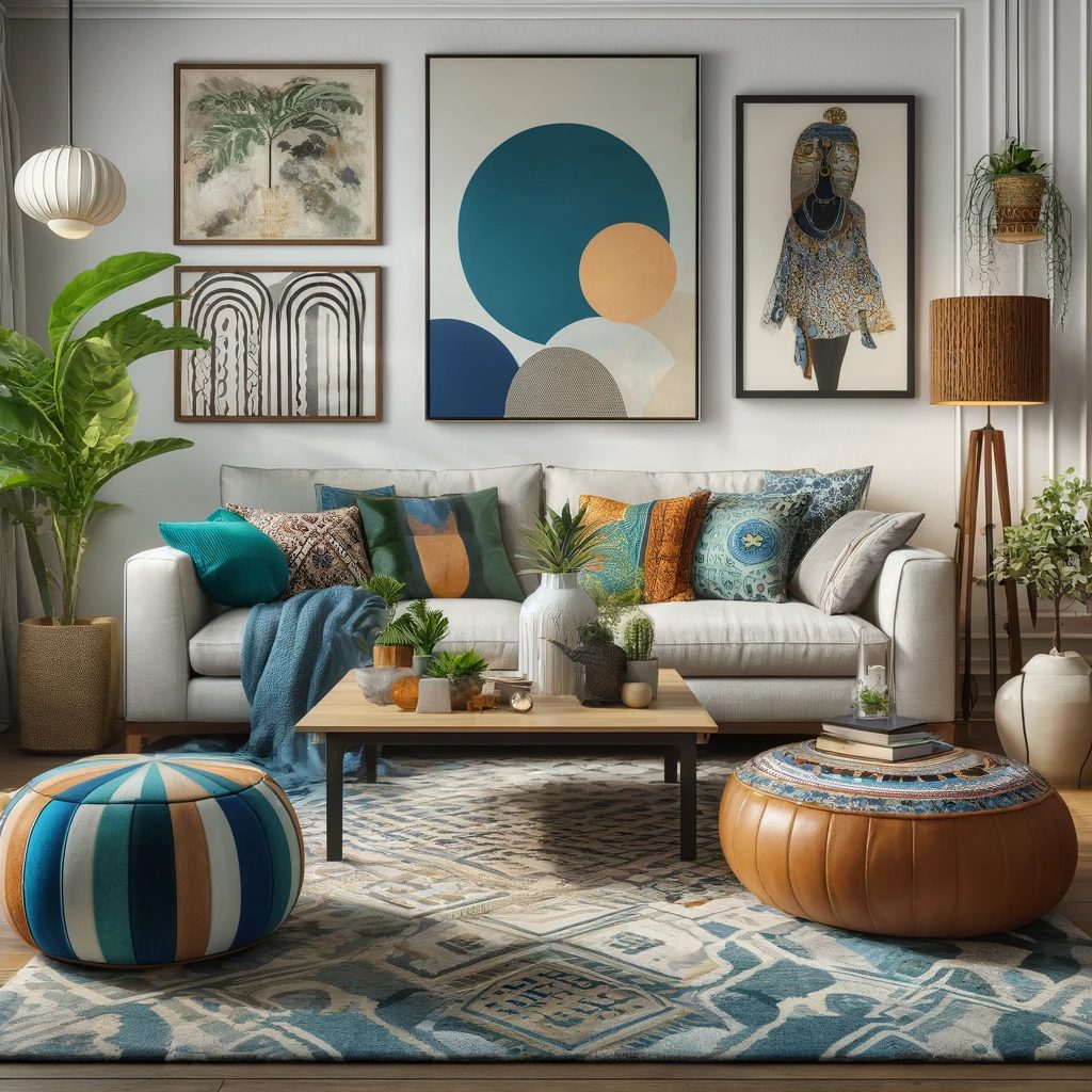
This well-coordinated modern yet eclectic living room exemplifies how diverse elements can coexist beautifully when tied together by a balanced color scheme and theme. This visualization should help you see the potential of combining different styles in your own space!
Mistake #2: Poor Lighting
Think of the last time you entered a space that was lit solely by one glaring overhead light; it likely felt uninviting and stark. Effective lighting enhances the mood and functionality of your space. Thankfully, this common interior design mistake is quite easy to remedy! Bright ideas for better lighting include utilizing a mix of ambient, task, and accent lighting to create layers that can be adjusted to suit any occasion. High-quality lighting fixtures can be found at retailers like Lamps Plus or West Elm, offering both style and substance.
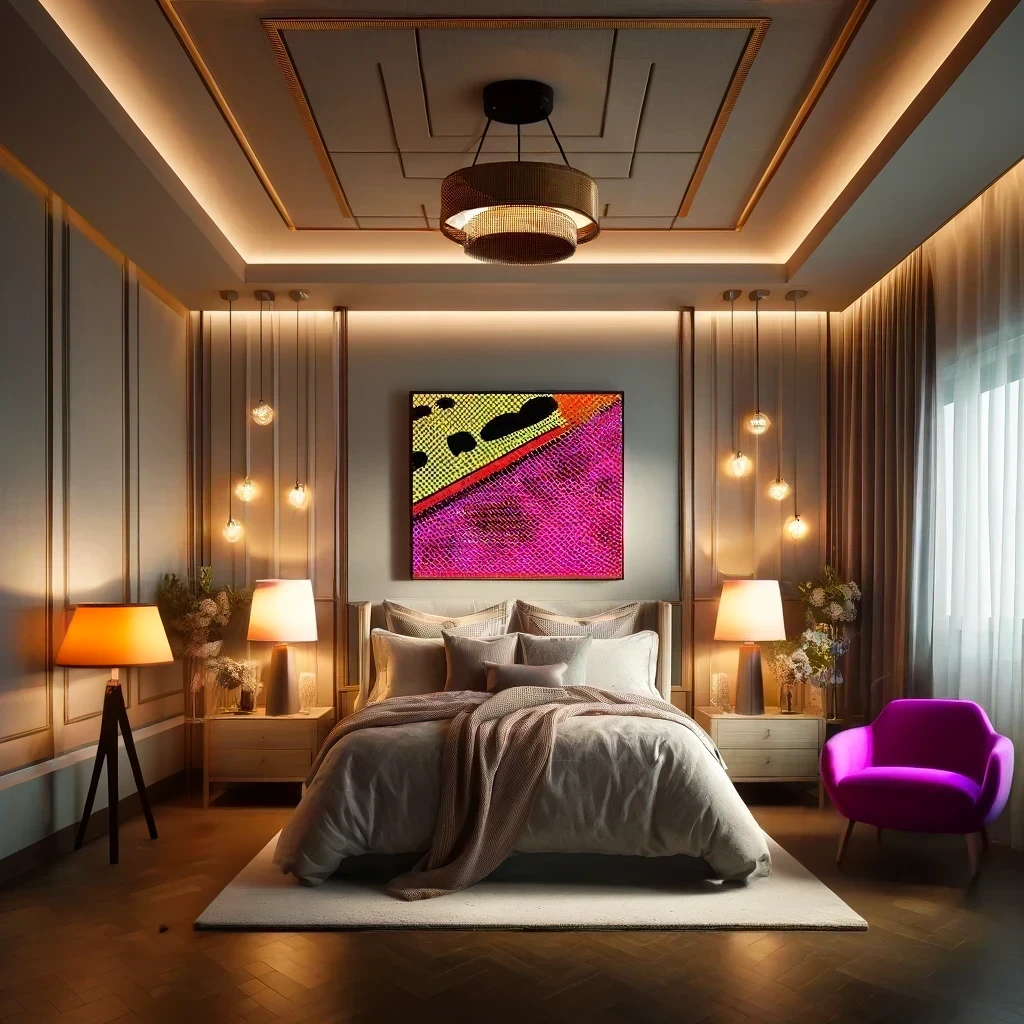
This bedroom is layered with soft lighting. This setup enhances the room’s appeal through ambient glow from corner lamps, task lighting on bedside tables, and accent lights that highlight artwork, creating a warm and inviting atmosphere. The modern side chair adds a vibrant and contemporary touch, which complements the pop art aesthetic and brings more depth and character to the overall design while basking in the adjacent natural light.
Mistake #3: Form Over Function
Visual appeal doesn’t have to come at the expense of comfort. Remember the last time you sat in a gorgeous chair that felt like a stone slab? To blend comfort with style, consider: Investing in furniture that feels as good as it looks. Retailers like CB2 and Pottery Barn specialize in offering pieces that combine aesthetic appeal with practical comfort.
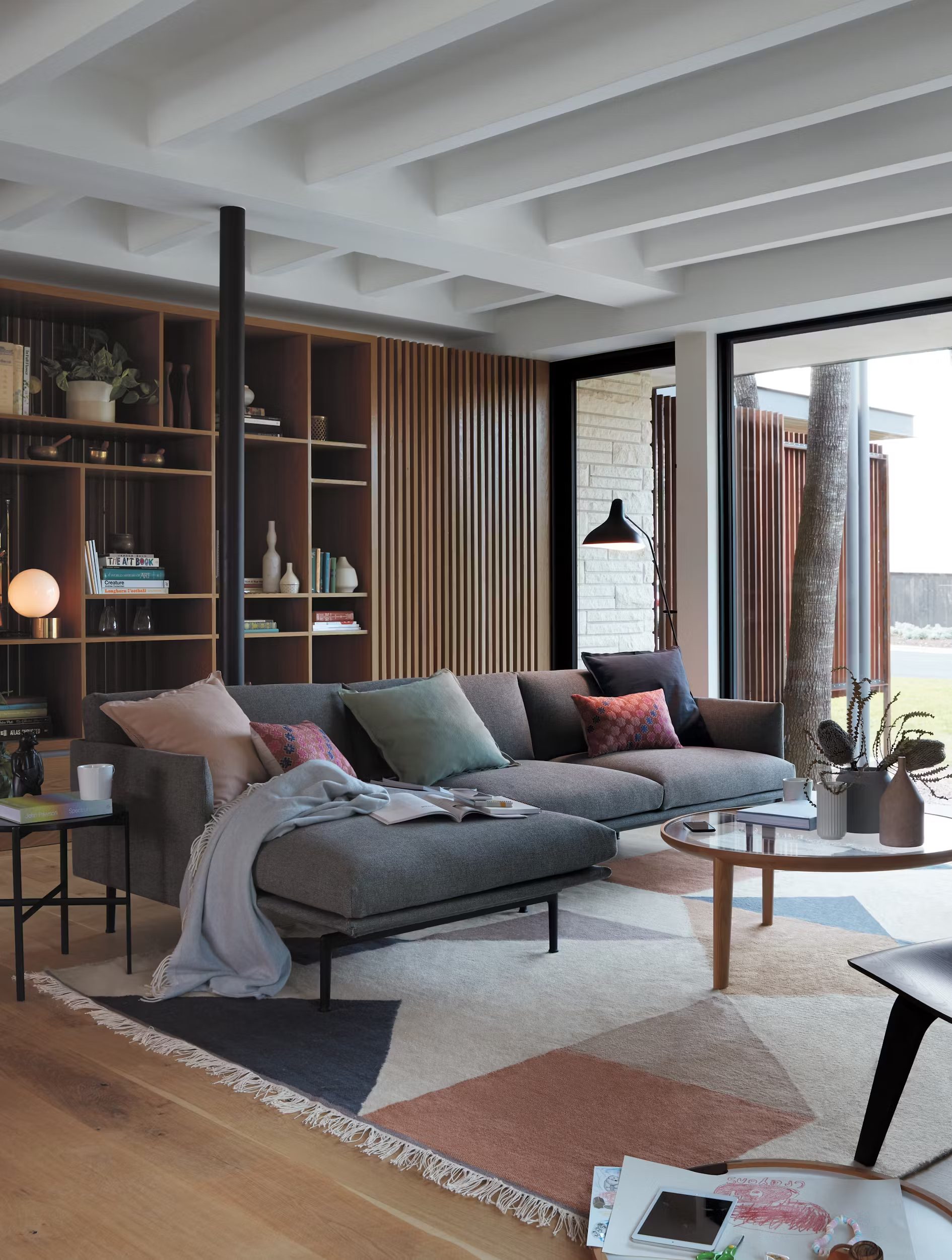
Comfortable living can showcase a luxurious, deep sofa piled with cushions and a soft, inviting rug underfoot. Adding these layers illustrates that style and comfort can coexist beautifully.
Mistake #4: Lack of Personalization
A home should reflect the personality and life experiences of those who live there. A space devoid of personal elements can feel more like a staged set than a lived-in environment. To infuse personality into your home, consider: Displaying items that reflect your personal life experiences, such as bespoke art pieces, family heirlooms, or unique finds from your travels. Utilize services like Framebridge to custom-frame your cherished memories or display collections on uniquely designed shelves from The Container Store.
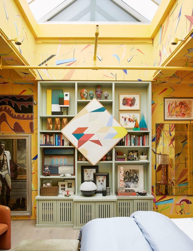
Solving this interior design mistake should be easy, but is often overlooked. We probably all have collected items from our travels, family history, and special moments–often just collecting dust, or creating clutter. But editing them into a curated collection and creating a thoughtful display featuring an eclectic mix of personal items, art, and books, your room is now transformed into a living story of your life.
Mistake #5: Playing It Safe With Color
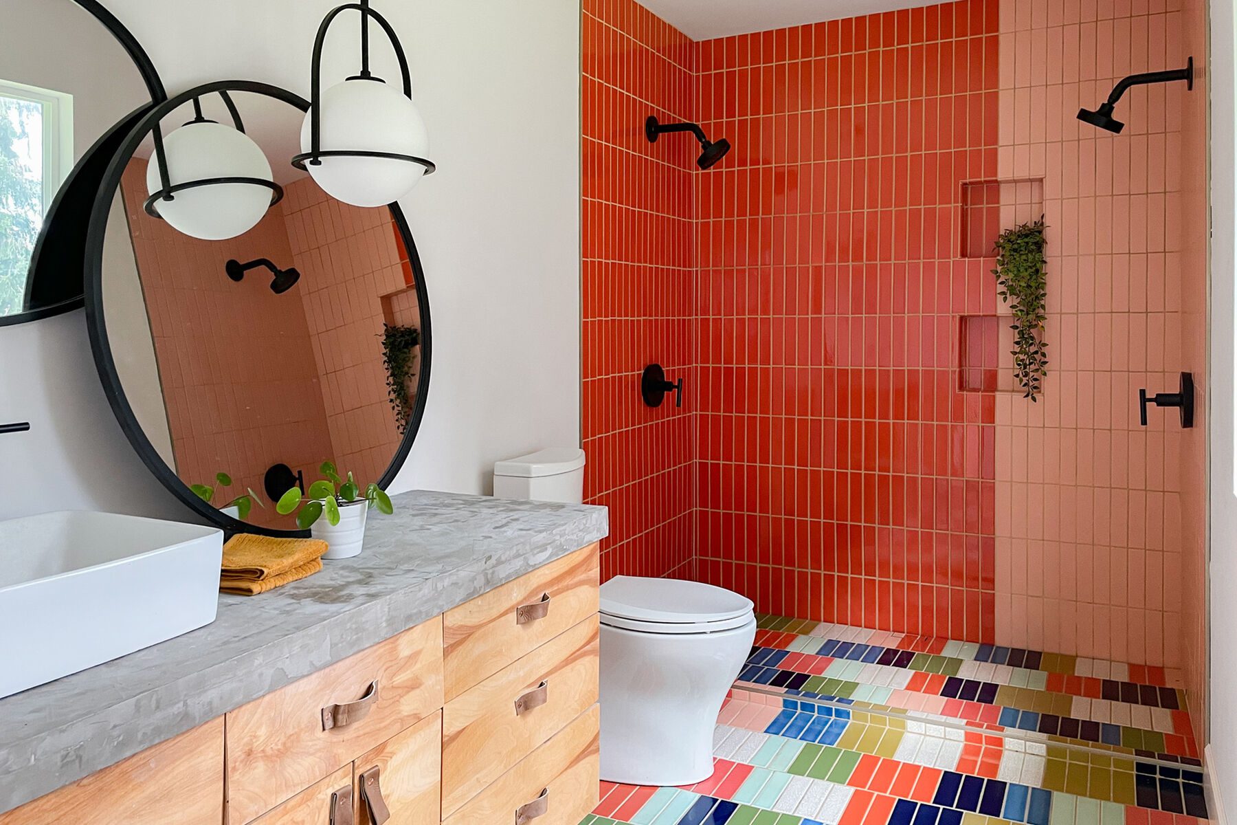
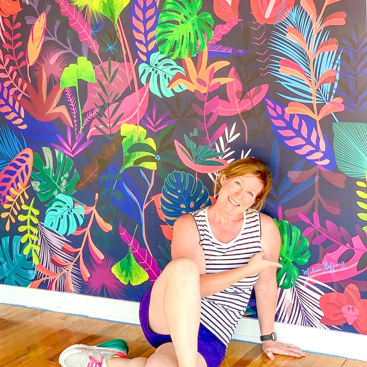
A timid approach to color can lead to spaces that feel uninspired. Imagine a room where all is taupe (not hard to imagine these days – we’re inundated with this view of neutral interiors); it’s peaceful but forgettable. Inject some color and life with: Dynamic hues that reflect your vibrancy and zest for life. Turn to brands like Benjamin Moore or Sherwin Williams for paint that can transform a dull room into a dynamic space. Explore accent pieces from vibrant retailers like HomeGoods or Crate & Barrel to add splashes of color.
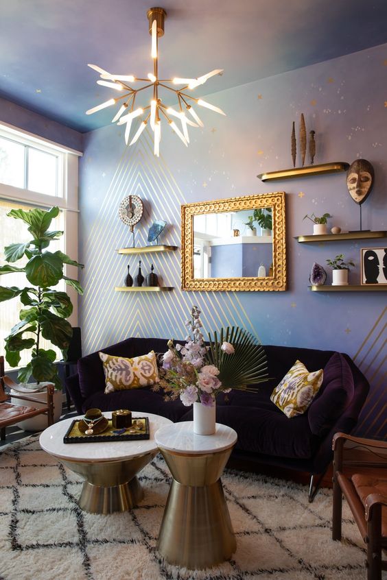
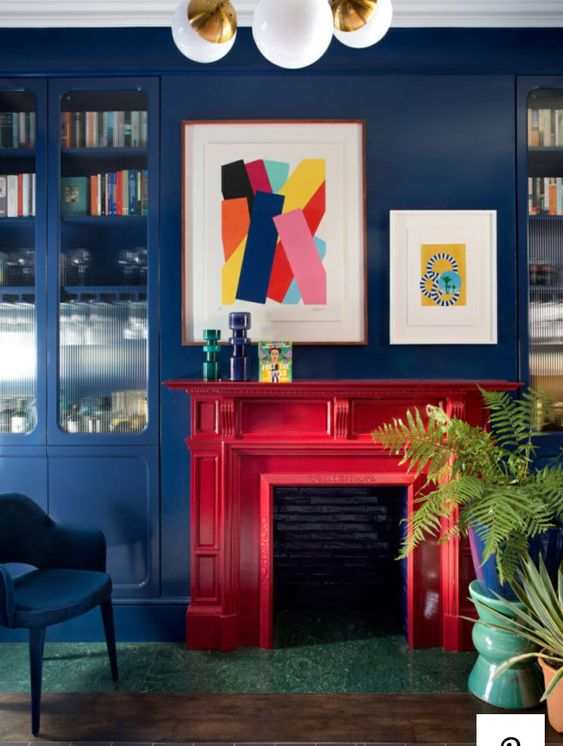
These rooms each use color differently. One is more soothing, and the other is vibrant and exciting. Neither is boring.
Avoiding these common interior design mistakes can dramatically enhance the functionality and aesthetic appeal of your home. Your space should not only look spectacular but also be a comfortable and true reflection of your personality. If you’re inspired but unsure how to begin transforming your home, reach out for a consultation. At Indigo Ink Designs, we’re eager to help you bring your vision to life with boldness and beauty.

